
A small living room doesn't need to apologise for itself. The rooms that feel biggest aren't the ones with the most square footage — they're the ones where every piece earns its place and the eye can travel without interruption. This small living rooms guide keeps the focus on proportion, maintenance, and how the room feels in daily use.
In our room edits, the change works only when it solves a visible problem instead of adding another layer to manage. Use the same restraint behind black floating wall shelves and window-first living rooms: measure first, repeat materials deliberately, and leave enough blank space for the change to read.
We studied dozens of compact living rooms in the 12–25 square metre range — the size of a typical urban one-bedroom — and the ones that worked shared the same set of moves. None of them required a renovation. None of them required matching furniture. What they shared was a discipline about how the eye reads the room, not how the inventory list reads on paper.
How do you make a small living room feel bigger?
A small living room feels bigger when the eye can see more continuous floor, wall, and window area. Start with low-profile seating, one generous rug, and furniture pulled slightly off the walls so the room has circulation instead of a packed perimeter. Keep the palette quiet, but warm the lighting to around 2700 K so cream, stone, and sage do not feel cold. Choose one dominant texture, such as linen or boucle, and repeat it instead of adding many small finishes. Use vertical storage for books, plants, and lamps so the floor stays open. The first test is simple: stand in the doorway and check whether you can see the window trim, the front legs of each main seat, and one clear walking path. If any of those disappear, edit the layout before buying decor.
| Design move | Why it works | First test |
|---|---|---|
| Low sofa profile | Keeps the sightline open to walls and windows | Check whether window trim remains visible above the sofa |
| One large rug | Unifies the seating zone instead of chopping the floor | Front legs of all main seating touch the rug |
| Warm layered lighting | Adds depth without visual clutter | Replace overhead-only lighting with one warm floor lamp |
| Vertical storage | Moves function off the floor | Books, plants, and lamps sit above the seating line |
Here are the seven principles, in the order we'd apply them.
1. Go low
Low-profile furniture is the single biggest spatial trick. A sofa with a seat height under 40 cm, a coffee table at knee level, a floor lamp instead of a table lamp — all of these keep the sightline clear to the walls and windows, which is what makes a room feel open. The mistake most people make in a small room is buying a cosy sofa with a high back and over-stuffed cushions. It feels great to sit in. It also visually crowds the room from the moment you walk in.
The Japandi-influenced living rooms we surveyed leaned hardest into this. Seat height around 38 cm, arms thinner than the cushions, and a wood frame visible on at least one side. The eye reads the floor under the sofa as continuous space, not as territory the sofa claims.
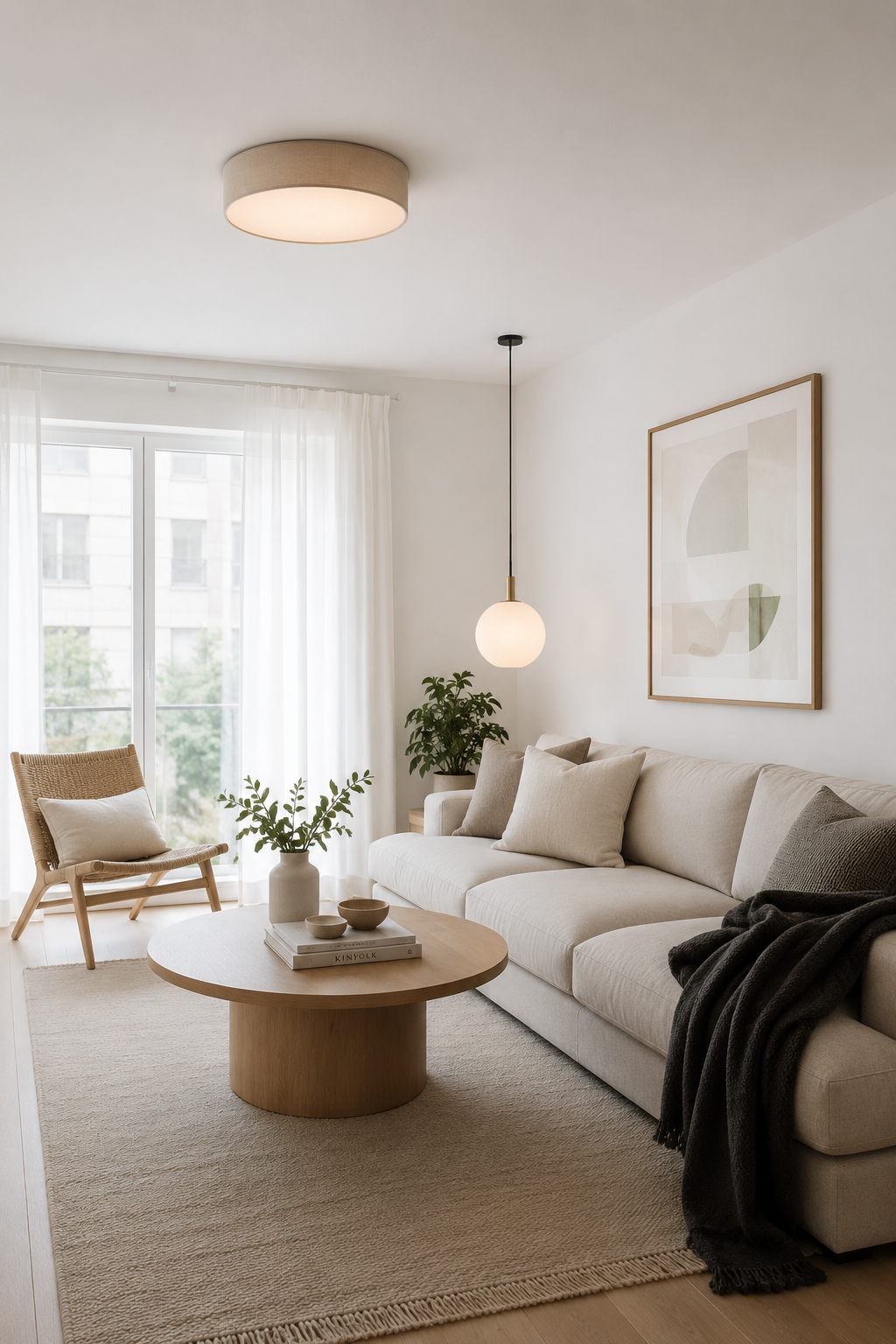
The Scandinavian approach takes this furthest: a slim linen sofa, a drum flush-mount ceiling light instead of a pendant, and nothing above eye level except the art. A pendant light hung 1.4 m below a 2.4 m ceiling effectively cuts the room in half visually. A flush mount preserves the full ceiling height and the room reads taller.
2. Choose one anchor texture
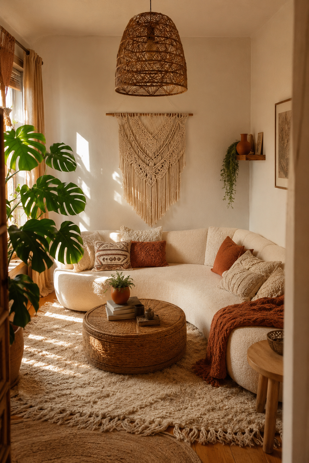
Boucle, linen, velvet — pick one and let it dominate. A room with three competing textures feels cluttered regardless of how few objects are in it. One texture repeated (sofa + curtains, or sofa + throw + cushion) reads as intentional calm.
This is the same logic behind the quiet power of a single good vase: one decisive material decision, repeated, reads as design. Three half-hearted decisions never do.
3. Warm the light, cool the palette
The rooms that feel most spacious combine a cool-neutral palette (cream, stone, sage) with warm-temperature lighting (2700 K). The walls recede; the light draws you in. It's the same trick restaurants use to make a 20-seat room feel intimate rather than cramped.
Golden-hour light does half the work. If your room faces west, lean into it — sheer curtains, no blinds, and let the afternoon do the decorating. If it faces north, a 2700 K floor lamp in the corner where the wall meets the ceiling gives you the same warm glow without the climate dependency. We covered the principle in detail in three lighting upgrades under $70 — the same logic applies at every scale.
4. Float the furniture
Pull everything off the walls. Even 15 cm of breathing room behind a sofa makes the room feel deliberate rather than packed. A floating layout also creates natural circulation paths that make the space feel walkable.
The instinct in a small room is to push everything against the perimeter to "open up the middle." It's the exact wrong move. A room with a 2 m × 2 m empty middle and furniture flat against three walls reads as a waiting room, not a living room. Pulling the sofa 30 cm off the wall and putting a slim console behind it creates two zones (a circulation zone behind, a seating zone in front) and the room reads as larger and more functional.
5. Edit the floor
One rug, placed so the front legs of the sofa sit on it. No rug layering in a small room — it chops the floor into zones and makes the space feel smaller. A single, generously-sized rug unifies the seating area and lets the eye read the room as one piece.
The size rule we use: the rug should extend at least 60 cm beyond the sofa on each side. A 1.6 × 2.3 m rug under a 2 m sofa reads as too small and makes the sofa look like it's standing on a postage stamp. A 2 × 3 m rug under the same sofa anchors the seating area and the room feels intentionally composed.
6. Vertical storage only
Bookshelves, not coffee-table stacks. Wall-mounted plants, not floor pots. The floor is the most valuable real estate in a small room — every object that sits on it costs you perceived space.
This is also the rule that makes five accessories that do the work of a whole redesign effective in tight quarters: a tall mirror leaning against a wall reads as architecture; the same money spent on small surface objects reads as clutter.
7. The one-in-one-out rule
The room is finished when you can't add anything without taking something away. That's not minimalism for its own sake — it's the practical ceiling of a compact space. Respect it and the room stays generous; ignore it and the walls close in.
For this choice, this section matters most when it is checked from the doorway and from the seat or counter where the decision will be seen every day. Give the idea at least 24 hours in normal morning and evening light, then remove one nearby object before deciding whether the room needs anything else.
A note on style choice
Whether you go Scandi, Japandi, boho, or a mix is far less important than getting the seven principles right. We've seen 14 m² living rooms in every style work beautifully when the furniture is low, the texture is consistent, and the floor stays uncluttered. We've also seen 30 m² rooms in expensive "design" furniture feel cramped because every piece is bulky and the rugs are layered three deep.
The brief is the same regardless of taste: low, consistent, warm, floated, edited.
A small room that feels calm is better than a large room that feels busy. Size is fixed; feeling is designed.
How to Use Small living rooms at Home
Start with measurements rather than mood. Mark the likely footprint with painter's tape, books, or a folded towel before buying or rearranging anything. A useful rule is to leave at least 60 cm for a main walkway, 35-45 cm between a sofa and coffee table, and 10 cm of visible border around small textiles or objects that sit on the floor. Those numbers are not decorative; they decide whether the idea feels calm once people actually move through the room.
Check the material against what is already present. If the room has several glossy surfaces, add matte texture. If it has many pale fabrics, add one grounded wood, stone, black, or brass note. If it already has strong contrast, keep the new piece quieter. The goal is not to match every finish, but to repeat one material family so the choice feels connected to the room instead of dropped into it from a product photo.
Plan maintenance before styling. Anything near water, food, pets, children, or direct sun needs a cleaning rhythm and a tolerance for wear. Soft textiles may need weekly washing, stone may need coasters, acrylic may need microfiber cleaning, wood may need pads under objects, and lighting may need a dimmer that is compatible with the fixture. A beautiful choice that is annoying to maintain usually becomes visual clutter within a month.
Use the one-in, one-out test after the change lands. Add the new piece, then remove one smaller object in the same sightline. If the room feels more intentional, leave the smaller object out. If the room feels bare, return it after a week. This keeps the edit from turning into accumulation and protects the calm that made the change worth considering in the first place. Used this way, small living rooms becomes part of the room's structure rather than a loose accent.
FAQ
How do I use this idea without making the room feel busy?
Use the change as one clear decision, then remove or quiet the nearest competing object. The room should gain a job, a material note, or a focal point rather than another small thing to maintain.
What should I measure before choosing it?
Measure the available width, depth, height, and the walkway that remains after the piece or idea is in place. For most rooms, 60 cm of clear passage and visible breathing room around the object prevents a styled choice from becoming an obstacle.
Can this work in a rental or small home?
Yes, if the choice is reversible and scaled to the room rather than the product photo. Freestanding pieces, textiles, plug-in lighting, removable hooks, and careful styling usually give the best result without changing the building.
What is the most common mistake with this idea?
The common mistake is treating the idea as decoration before checking proportion and maintenance. If the size is wrong or the material is hard to live with, even an attractive choice will make the room feel less settled over time.


