Five accessories that do the work of a redesign work best with clear scale, placement, material, and maintenance choices before the room fills with new decor.
A full redesign costs months and thousands. But most rooms don't need new furniture — they need one or two objects that change how the space reads. These five categories consistently deliver the biggest visual shift for the least money and effort. This five accessories that do the work of a redesign guide keeps the focus on proportion, maintenance, and how the room feels in daily use.
In our room edits, the change works only when it solves a visible problem instead of adding another layer to manage. Use the same restraint behind single good vase and things you already own: measure first, repeat materials deliberately, and leave enough blank space for the change to read.
The principle behind the list: each of these works because it changes either the scale, texture, or focal point of a room. New cushions and a different lampshade are tweaks. The five below are leverage.
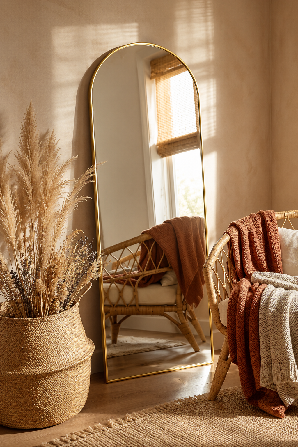
1. A floor mirror (leaning, not hung)
A full-length mirror leaning against a wall does three things at once: it doubles the perceived depth of the room, it bounces natural light into dark corners, and it adds a vertical line that makes ceilings feel taller.
The rule. The mirror should be at least 150 cm tall. An arched top reads softer than a rectangle. Lean it — don't hang it — so it feels like furniture rather than a fixture. Hanging a tall mirror requires drilling into a stud and is a commitment; leaning is reversible and reads as casual rather than formal.
Where to put it. Opposite a window if you want to maximise reflected daylight. On a wall perpendicular to the light source if you want to lengthen the room visually. Avoid the wall directly behind a sofa — the sightline angle is wrong for both reflection and proportion.
What to spend. £80–£200 for a decent leaner in a finish that won't look cheap (matte black, brushed brass, raw oak). Below £80 you're in plastic-frame territory; above £400 you're paying for a brand name. The sweet spot is in the middle.
DUMOS Arched Full Length Mirror with Stand
64 x 21 inch black aluminum-frame arched mirror with stand, hanging hardware, and shatterproof nano glass for bedrooms, living rooms, and cloakrooms.
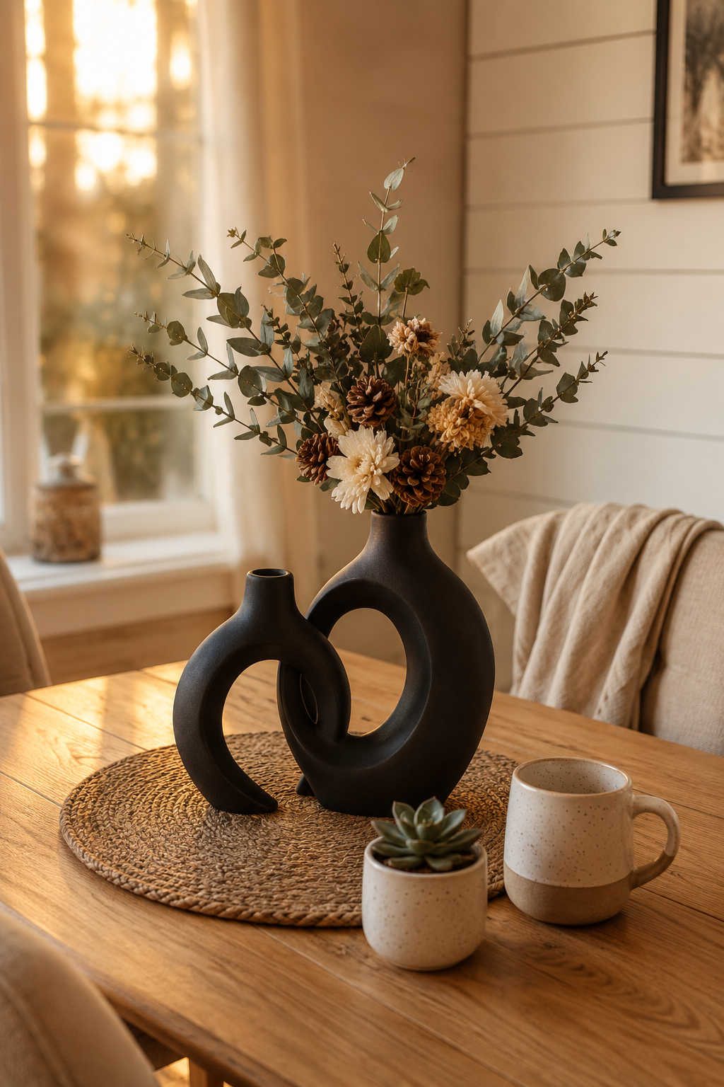
One oversized vase on a sideboard or the floor next to a doorway reads as architecture. It doesn't need flowers. The shape itself is the decoration.
What to look for. Matte finish, organic shape, at least 25 cm tall — anything smaller reads as a knick-knack rather than sculpture. Avoid anything that looks like it belongs in a florist's window. You want a piece that holds the eye on its own terms, not one that demands stems to justify its presence.
The donut and pebble shapes we keep returning to share a logic: the silhouette is interesting from any angle, and the matte surface absorbs light rather than reflecting it. A glossy ceramic vase competes with windows for attention; a matte one settles into the room and stays there.
The empty rule. Half the homes we photograph have at least one vase that's been sitting empty for years. That's correct. We'd rather see one well-chosen empty vase than a vase forced into use with stems past their prime. The single decoration that requires no maintenance is the one you'll keep loving in three years.
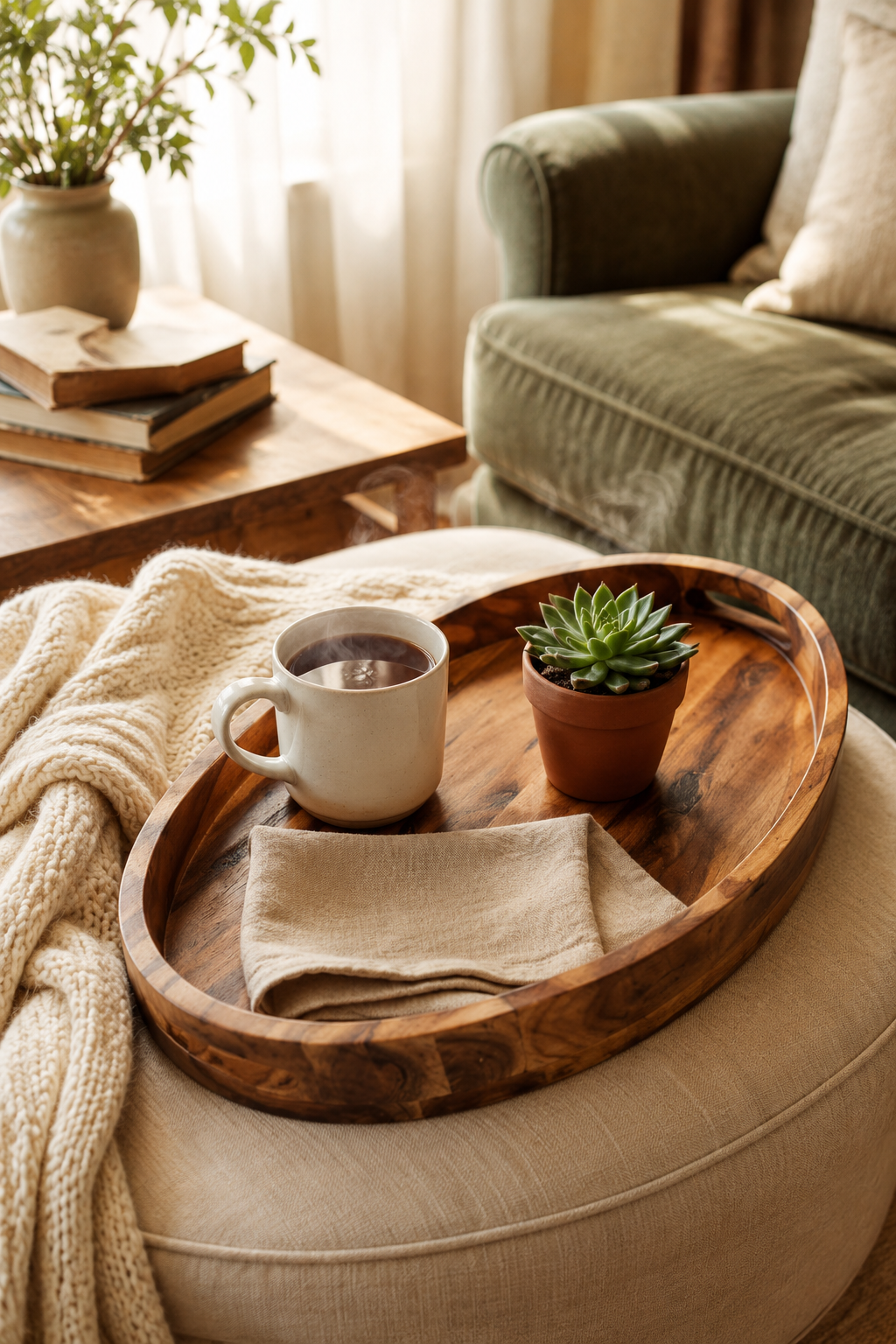
3. A wooden tray (the instant stylist)
A tray on a coffee table or ottoman turns a random collection of objects into a vignette. Candle, book, small ceramic — scattered on a surface they look like clutter; grouped on a tray they look curated.
Material matters. Acacia or walnut with visible grain. The warmth of real wood grounds a room in a way that lacquered or painted trays can't. Oval shapes feel less rigid than rectangles, and a 40–50 cm long tray fits most coffee tables without dominating them.
The styling rule. Three objects, varying heights, odd numbers. A candle, a small ceramic, and a stack of two coffee-table books is a classic for a reason. Add a fourth object and the tray reads as cluttered rather than composed.
Practical bonus. It corrals the everyday flotsam that accumulates on a coffee table. Coasters, the TV remote, a half-finished crossword — they all live on the tray rather than the bare surface, which means you can wipe the table down in two seconds.
HouseJoy Acacia Wood Serving Tray with Handles
16.5 x 13 inch acacia wood tray with handles for ottomans, coffee tables, breakfast in bed, bathroom styling, and candle displays.
A single wall with two or three floating shelves — styled with one object per shelf — creates a focal point without floor clutter. The key is restraint: one candle, one small plant, one ceramic. Not a library.
Placement. Eye level or slightly above. Never below the sofa-back height — that reads as an afterthought. The bottom shelf should sit at least 1.4 m off the floor on a standard 2.4 m ceiling.
Material. Solid wood (oak, walnut, or live-edge) reads warmer than melamine or MDF. The price difference is meaningful but the visual difference is greater — a £30 painted shelf and a £120 oak shelf are not the same object even when they hold the same things.
What to skip. Glass shelves (cold), painted white shelves (institutional), and anything sold as "rustic" with deliberate distressing (theatrical).
5. One oversized plant
A single large plant (fiddle leaf fig, monstera, areca palm) in a woven basket does more for a room than ten small succulents on a windowsill. It adds life, height, and organic texture in one move.
The basket trick. A £12 woven basket hides the plastic nursery pot and adds texture. No need to repot — just drop the plant in, fold the basket rim over, done. We've kept the same plants in their original nursery pots inside cycling baskets for five years; it's easier to repot up a size when the time comes.
Care realism. A fiddle leaf fig is the photographic standard but it's also the most demanding. If you're not at home consistently, a snake plant or zz plant in a tall basket gives you 80 % of the visual impact for 10 % of the maintenance. Match the plant to the home you actually live in, not the one you imagine.
The order of operations
If you're starting from scratch, buy in this order:
Mirror — biggest spatial impact, immediately changes how the room reads.
Plant — biggest life and texture impact, takes a single trip to a garden centre.
Vase — sculptural anchor, but only after you've seen what the room looks like with the first three.
Shelves — last, because they require wall fixings and styling confidence.
Each one is a standalone upgrade. You don't need all five to feel the difference — even one changes how you experience the room. We covered the rationale for fewer, bigger objects in the quiet power of a single good vase; this article is the practical extension of that principle.
This final check is deliberately practical: look at the section from the doorway, then again from the place where you use the room most often. If the idea only works from one angle, simplify the surrounding objects before you add anything else.
How to choose by room problem
If the room feels flat, start with height: the floor mirror, plant, or floating shelves. Flat rooms usually have everything at sofa height, which means the eye has nowhere to travel. One vertical object changes the rhythm immediately. If the room feels cluttered, start with the tray or the vase. Both create a clear focal point and make it easier to remove small objects that were only filling space.
If the room feels dark, the mirror earns priority only when it can catch real light. A mirror opposite a blank wall will double the blank wall. Place it where it reflects a window, lamp, plant, artwork, or doorway. If there is no useful reflection, a tall plant or ceramic lamp will do more. If the room feels unfinished even though it has enough furniture, choose one oversized object in a material the room is missing: wood in a painted room, ceramic in a fabric-heavy room, greenery in a room of hard surfaces.
The scale test
Before buying, mark the footprint with painter's tape or a stack of books. A mirror should feel like furniture, not a wall sticker. A tray should hold three useful objects without covering the whole table. A vase should be visible from the doorway. Shelves should fill a wall zone rather than float alone. A plant should reach at least the height of a nearby lamp or chair back; otherwise it will read as a tabletop plant that lost its table.
This scale test prevents the most common accessory mistake: buying a smaller, cheaper version of the right idea. A 90 cm mirror, a 12 cm vase, and a 20 cm tray may all be attractive in isolation, but they rarely have enough presence to change a room. If the budget is tight, buy one correctly scaled piece later instead of three small pieces now.
Material priorities
Natural materials make these accessories work harder. A wood tray brings grain, a stoneware vase brings matte weight, a plant brings irregular shape, and a mirror frame in brass, black metal, or oak adds a clean line. Plastic, shiny chrome, and distressed "rustic" finishes usually read temporary. They can work in specific rooms, but they are less forgiving when the goal is calm.
Repeat one material from the room so the accessory feels connected. If the coffee table is oak, an oak-framed mirror may be enough. If the room has black window frames, a black shelf bracket can look intentional. The repeat should be quiet, not exact. Matching every finish makes a room feel bought as a set; repeating a finish once makes it feel edited.
What not to combine
Do not add all five upgrades to the same sightline. A mirror beside shelves above a tray beside a floor vase beside a tall plant is too much leverage in one corner. Spread the moves through the room: one vertical piece, one surface edit, one organic element. Then stop and live with it for a week. The goal is not to prove that every accessory category works. The goal is to make the room feel resolved with as few moves as possible.
The best accessories don't decorate a room. They reframe it — they change what your eye notices first when you walk in.
How to Use Five accessories that do the work of a redesign at Home
Start with measurements rather than mood. Mark the likely footprint with painter's tape, books, or a folded towel before buying or rearranging anything. A useful rule is to leave at least 60 cm for a main walkway, 35-45 cm between a sofa and coffee table, and 10 cm of visible border around small textiles or objects that sit on the floor. Those numbers are not decorative; they decide whether the idea feels calm once people actually move through the room.
Check the material against what is already present. If the room has several glossy surfaces, add matte texture. If it has many pale fabrics, add one grounded wood, stone, black, or brass note. If it already has strong contrast, keep the new piece quieter. The goal is not to match every finish, but to repeat one material family so five accessories that do the work of a redesign feels connected to the room instead of dropped into it from a product photo.
Plan maintenance before styling. Anything near water, food, pets, children, or direct sun needs a cleaning rhythm and a tolerance for wear. Soft textiles may need weekly washing, stone may need coasters, acrylic may need microfiber cleaning, wood may need pads under objects, and lighting may need a dimmer that is compatible with the fixture. A beautiful choice that is annoying to maintain usually becomes visual clutter within a month.
Use the one-in, one-out test after the change lands. Add the new piece, then remove one smaller object in the same sightline. If the room feels more intentional, leave the smaller object out. If the room feels bare, return it after a week. This keeps the edit from turning into accumulation and protects the calm that made the change worth considering in the first place. Used this way, five accessories becomes part of the room's structure rather than a loose accent.
FAQ
How do I use this idea without making the room feel busy?
Use the change as one clear decision, then remove or quiet the nearest competing object. The room should gain a job, a material note, or a focal point rather than another small thing to maintain.
What should I measure before choosing it?
Measure the available width, depth, height, and the walkway that remains after the piece or idea is in place. For most rooms, 60 cm of clear passage and visible breathing room around the object prevents a styled choice from becoming an obstacle.
Can this work in a rental or small home?
Yes, if the choice is reversible and scaled to the room rather than the product photo. Freestanding pieces, textiles, plug-in lighting, removable hooks, and careful styling usually give the best result without changing the building.
What is the most common mistake with this idea?
The common mistake is treating the idea as decoration before checking proportion and maintenance. If the size is wrong or the material is hard to live with, even an attractive choice will make the room feel less settled over time.