The all-white interior has a bad reputation. When done poorly, it looks like a sterile laboratory or an empty art gallery waiting for the exhibit to arrive. It feels cold, unwelcoming, and impossible to keep clean. But when executed correctly, a palette based entirely on warm whites, creams, and ivories is the most luxurious, calming aesthetic you can bring into a home.
The difference between clinical and cozy lies in two things: the undertone of the paint and the layering of textures. If you simply paint the walls brilliant white and buy a flat white cotton sofa, the room will fail. If you paint the walls a soft clotted cream, bring in a nubby ivory bouclé armchair, drape a heavy wool throw over a linen sofa, and anchor it all on a faded beige rug, the room succeeds.
For another take on inviting neutrals, read our guide on earth-toned palettes that aren't flat beige. To see how these neutral concepts apply to specific furniture pieces, explore our travertine coffee table ideas. This article will teach you how to build a soft, layered white and cream palette.
The Spectrum of Warm Whites
Before you pick up a paintbrush, you must understand undertones. Every white paint is essentially a very pale version of another colour.
- Cool whites have blue, green, or grey undertones. They look crisp and modern but can feel icy in north-facing rooms.
- Warm whites have yellow, pink, or peach undertones. They feel soft, welcoming, and mimic the glow of golden hour sunlight.
When building a warm white palette, you want to live entirely in the latter category. Alabaster, ivory, cream, and ecru are your foundational colours. The trick is not to choose just one.
A room painted entirely in one exact shade of white looks flat. Instead, you must intentionally clash your whites. Paint the walls a soft cream, paint the trim a slightly brighter warm white, and choose curtains in an unbleached linen tone. This subtle variation tells the eye that the room is curated and deliberate, rather than just primed and unfinished.
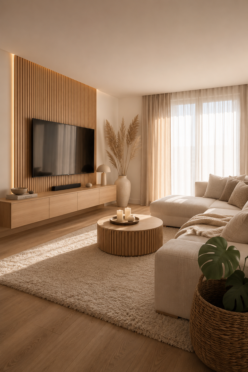
The Golden Rule: Texture Replaces Colour
In a brightly coloured room, the colour itself provides visual interest. A navy blue wall next to a mustard yellow chair is interesting because of the contrast in hue. When you remove colour from the equation, you must replace that lost interest with texture. If everything in a white room is smooth — flat painted walls, smooth cotton upholstery, sleek glossy floors — the room will look dead.
You must force high-contrast textures against each other. Consider these pairings:
- Soft and Rough: Place a delicate, diaphanous linen sheer curtain against a wall painted in a textured lime wash or Roman clay.
- Plush and Hard: Anchor a smooth, hard travertine or light oak coffee table on top of a deep, plush Moroccan Berber rug.
- Matte and Glossy: Pair matte, chalky ceramic vases with a sleek, highly polished marble side table.
The more texture you layer into a warm white room, the richer and more expensive it feels. Bouclé, shearling, chunky knit wool, tumbled linen, and raw silk are all essential tools in the neutral decorator's arsenal.
Anchoring the Airiness
One common mistake in all-white rooms is the "floating effect." Without any dark colours to provide visual weight, the furniture can feel like it's floating untethered in a white cloud. To prevent this, the room needs anchors.
You don't need to introduce bright colours to anchor a room; you just need contrast in value (lightness vs. darkness).
- Wood Tones: Natural wood is the best friend of a warm white palette. Pale woods like ash or white oak maintain the light, airy feel, while mid-tone woods like walnut provide a necessary grounding effect. A walnut side table in an ivory room instantly gives the eye a place to rest.
- The Touch of Black: Every room needs a touch of black, but this is especially true in a white room. It doesn't need to be much — a matte black picture frame, the thin metal legs of a chair, or a black ceramic bowl. These tiny punctuation marks of black sharpen the soft whites around them.
- Warm Metallics: Unlacquered brass and aged bronze are excellent anchors. The warmth of the brass complements the yellow undertones of the cream paint, adding a layer of subtle glamour.
Practicality and Maintenance
The elephant in the room when discussing white decor is dirt. Is it practical? Yes, if you plan for it.
Do not buy a brilliant white velvet sofa if you have toddlers and a golden retriever. Instead, choose performance fabrics. Crypton and Sunbrella make incredibly durable, stain-resistant fabrics in beautiful soft creams and ivories that can withstand red wine spills and muddy paws.
Slipcovered furniture is another practical choice. A slipcovered linen sofa looks relaxed and elegant, and when it inevitably gets dirty, the covers can be removed and bleached. For rugs, avoid pure white high-pile carpets. Instead, opt for patterned vintage rugs faded to beige, or natural fibers like jute and sisal, which hide dirt exceptionally well while contributing to that vital textured look.
Layering warm whites and creams is an exercise in restraint and subtlety. It requires you to look closer, to appreciate the slight difference between ivory and ecru, and to value the feel of a fabric as much as its appearance. The result is a home that feels like a permanent, peaceful sanctuary.


